Gift card pictures work best when the image fits the message, the channel, and the rights you need. A birthday text, an ecommerce banner, a printable voucher, and a paid ad can all use different styles and file types, so the safest choice is not always the prettiest picture.
Where to find gift card pictures
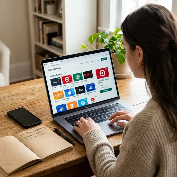
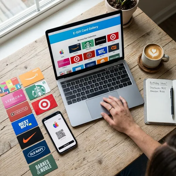
Gift card pictures are available from stock libraries, online design tools, template shops, retailer pages, and custom design work. The best source depends on whether you need a quick visual, an editable file, a print-ready layout, or a branded design.
| Source | Best for | Check before using |
|---|---|---|
| Stock photo sites | Blog images, banners, social posts, general visuals | Commercial rights, editing limits, watermarks |
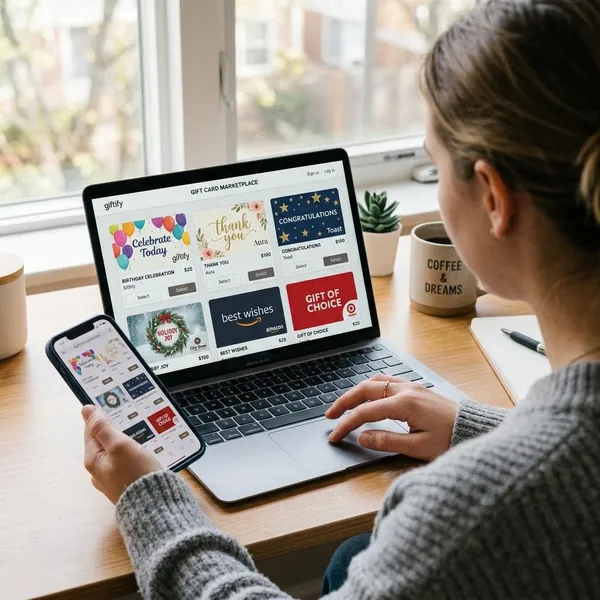
| Design tools | Editable cards, quick personal designs, branded layouts | Export quality, font rights, print settings |
| Template markets | Small businesses, seasonal offers, printable vouchers | Software needs, resale rules, extended licenses |
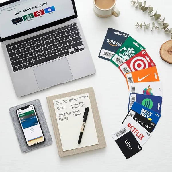
| Retailer websites | Choosing an official store gift card | Logos, trademarks, brand artwork |
| Custom designs | Unique events, campaigns, brand-specific cards | Source files, print size, usage rights |
How to choose the right gift card image
A good gift card image should be easy to understand before anyone reads the small details. The occasion, visual style, text space, file quality, size, and license all affect whether the picture will work in practice.
Match the occasion
Start with the reason for the gift card. A birthday design can use bright colors, confetti, balloons, or playful lettering. A wedding card often works better with soft tones, elegant type, and fewer decorative elements.
The same rule applies to business themes. A spa card should feel calm and clean, while a gaming gift card can be brighter and more energetic. A luxury shop and a children's toy store should not use the same visual mood.
Pick the right style
Minimal designs look modern and clear. Illustrated designs feel friendly and creative. Photo-based designs can feel warmer, especially when they show wrapping paper, hands, shopping bags, coffee cups, flowers, or a home setting.
Choose the style that keeps the main message visible. If the card amount, code, or call to action matters, avoid busy backgrounds and tiny decorative details. A design that looks impressive on a desktop can become hard to read on a phone.
Check image quality
Blurry or pixelated pictures make a gift card look careless. For digital use, choose an image that stays sharp at the size where it will appear. For print, use a high-resolution file, often 300 DPI, so text, logos, and borders do not look soft on paper.
- Use a clean file without unwanted watermarks.
- Avoid stretching a small image to fit a large banner or print layout.
- Check that there is enough empty space for names, amounts, or redemption details.
- Preview the design on the screen or paper size where people will actually see it.
Choose the right size
Size depends on the final channel. A social post, email header, website banner, mobile message, printable voucher, and story image all need different dimensions.
For online use, the file should be large enough to look sharp but not so large that it slows a page or email. For print, confirm the exact card size before designing and leave safe space near the edges.
If the picture includes a QR code, barcode, voucher code, or redemption code, keep it away from the trim area and test that it can still be scanned or read.
Review the license
Licensing decides whether you can download, edit, publish, print, advertise with, or resell a gift card picture. Free does not always mean free for every purpose.
Personal messages usually have fewer requirements than paid ads, ecommerce listings, printed flyers, client work, or downloadable templates. When the image includes people, logos, characters, branded cards, or another creator's artwork, check the terms more carefully.
- Confirm whether personal or commercial use is allowed.
- Check if editing, adding a logo, or changing text is permitted.
- Look for limits on resale, templates, print-on-demand products, and client work.
- Choose neutral artwork when brand rights are unclear.
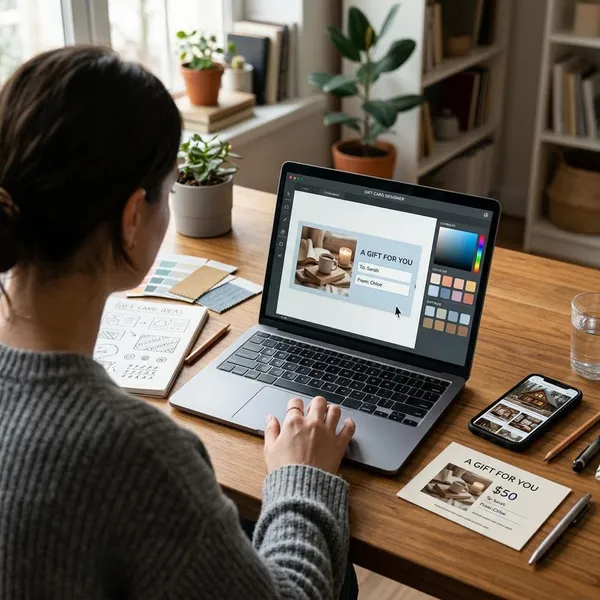
How to make your own gift card picture
Making your own gift card picture is often the best option when you need a specific message, brand style, or print format. A simple layout with clear text usually works better than a crowded design with too many effects.
Choose the purpose
Decide first how the picture will be used. A digital card for a friend can be personal and warm. A business gift card should be clearer, more structured, and consistent with the brand.
A printable voucher may need value, code, date, terms, and redemption instructions. A social media teaser may only need one strong message and a simple visual. The purpose tells you how much text belongs on the card.
Pick a layout
Most gift card layouts need one main visual area, a headline, the gift amount or message, and a small space for extra details. Keep the most important information near the center or in another easy-to-see area.
- Use a clean grid for business cards or store promotions.
- Place text on a plain area, overlay, or solid shape when using a photo background.
- Leave enough breathing room so the design still works on a phone.
Add text and colors
Keep the wording short. Phrases such as "Happy Birthday," "A Gift for You," "Thank You," "Holiday Gift Card," and "Treat Yourself" are easy to understand quickly. If the card has a value, make the amount clear.
Colors should fit the mood and stay readable. Red and gold can feel festive, soft green and beige feel calm, and black with white can look modern or elegant. For a business card, use brand colors only if the contrast is still strong enough for text.
Use clean graphics
Choose one main visual idea and support it with simple elements. A coffee shop card might use a cup icon and warm tones. A beauty salon card might use soft lines, neutral colors, and a small floral accent.
Avoid mixing too many styles in one small design. Cartoon icons, realistic photos, heavy patterns, and luxury fonts can look confusing when placed together. Consistent graphics make the card feel more trustworthy and easier to read.
Export the final file
Export the file according to how it will be used. PNG is a strong choice for digital cards with text, icons, or transparent areas. JPG works well for photo-heavy images with smaller file sizes. PDF is usually better for print because it keeps the layout stable.
- Check spelling, amount, name, code, and date before exporting.
- Preview the design on the screen size or paper size where it will appear.
- Test any QR code, barcode, or redemption code.
- Keep the editable source file in case the card needs changes later.
Conclusion
The best gift card pictures are clear, sharp, suitable for the occasion, and safe for the intended use. Stock images and templates are convenient, design tools give you more control, and custom designs work best when the card needs to feel personal or match a brand. Before using any picture publicly or commercially, check the license, file quality, size, and any visible brand elements.